07 Formative Feedback
This week, we had a Formative feedback. Andreas was concerned about my progress, and honestly, he had good reasons to be. I've been making things and gathering research, but I wasn't presenting it clearly or connecting it compellingly. This week forced me to confront what I've been avoiding and procrastinating. It clarified what I need to focus on going forward.
Week-seven
29.Sep~ 05.Oct, 2025Journal-by
Choi YerinKeywords
- Formative-feedback
- Prioritization
- Tangibility
- Easing-visualizer
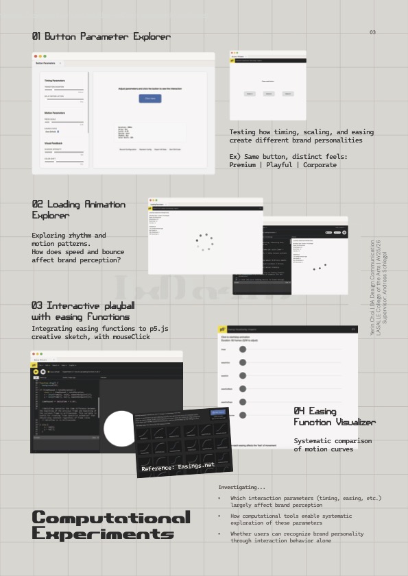
Experiments Progress
Easing Function Visualizer
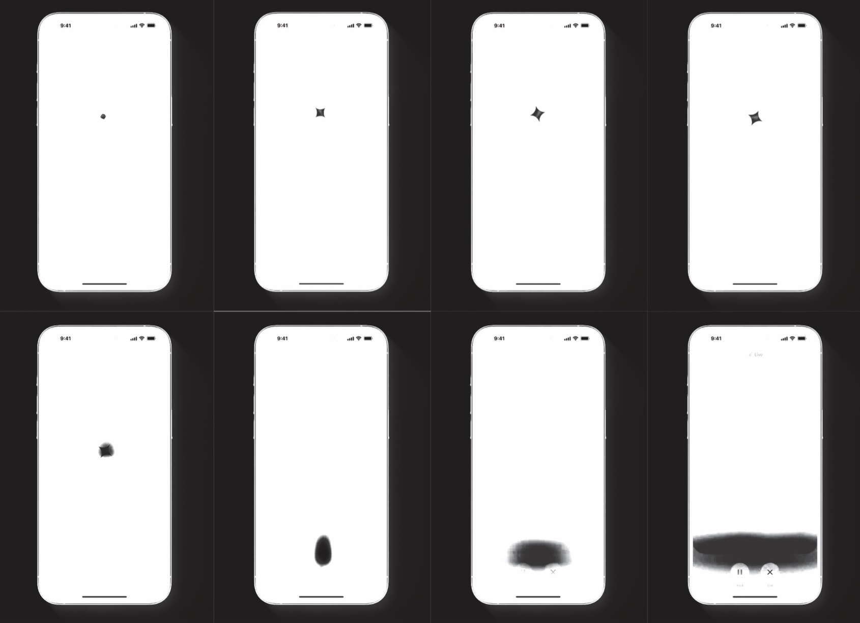
Continued exploring easing functions by building a visualizer in p5.js that compares six different easing types side by side.
Click to Start/Stop animation
and adjust frames with Q/W
Easing functions tested:
Linear - No easing, constant speed (feels mechanical)
EaseInOut- Smooth start and end (balanced, common in UI)
EaseOut - Fast start, slow end (most common for UI feedback)
EaseOutBack - Slight overshoot creating bounce (playful)
EaseOutExpo - Dramatic deceleration (luxury feel)
EaseOutBounce - Full bouncing effect (very playful, game-like)
The visualizer shows circles moving across the screen simultaneously, each following a different easing curve. I added duration control (Q/W keys to adjust frames) so I can test how timing affects the perception of each easing type.
Implementation approach:
I used mathematical functions from easings.net, implementing the actual formulas rather than approximating. This ensures accurate representation of each easing curve. The duration parameter (adjustable from 20-180 frames) lets me test how speed interacts with easing type to create different brand impressions.
What I learned:
I watched tutorials on drawing easing curves and understanding the math behind them. Also explored desmos.com to graph the mathematical functions and understand their behavior more systematically. Understanding deltaTime helped me see how to make animations consistent across different frame rates.
reference video 01
reference video 02
Inspiring Pitch:
Design Factory @ SIT
We had an inspiring talk from Jeffrey Koh and Aditi Neti from SIT's Design Factory, innovation center. They work across Service Design, Industrial Design, UI/UX, and Creative Technology.
Projects that stood out to me was their work-in-progress mural for Digital Punggol District, not just a static mural but an interactive digital experience. They worked with artists with disabilities, creating participatory art where people could create their own characters with generated visuals and textures. This reminded me of the potential for my AR mural app project last year (Singapore Street Archive).
Their gamification approach was also really interesting: take the most boring topic and make it an engaging game experience. This validates that thoughtful interaction design can transform how people engage with content.
Useful framework:
MoSCoW Prioritization
They showed a prioritization tool: Must have, Should have, Could have, Won't have. This framework immediately felt useful because I've been doing too many things concurrently without clear priorities. I decided to apply this to my project.
Formative Feedback
brochure-front
brochure-back
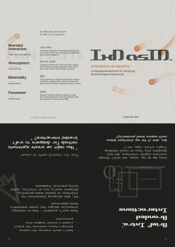
I prepared a brochure gathering my experiments with a little intro and glossary on the back for terminology. During the feedback Andreas was concerned about my progress. Not because I haven't done work (I have), but because I was not presenting it clearly or compellingly.
Two main problems identified
01 Clear presentation
- My work exists but isn't communicated tangibly
02 Compelling ideas
- Not making the research accessible or engaging enough
The Core Issues
Lack of concrete examples:
Beyond my Apple analogy, I couldn't provide clear examples of atmospheric branding or branded interactions during the presentation. I've gathered case studies in FigJam, but videos are hard to present physically. I thought "FigJam will do it" because it's all videos that can't be printed. But I was wrong. As a designer, I need to make my research more compelling, clearer, and tangible through design and good communication. Even good work has to be delivered in a clear, tangible way. and that's also part of user experience, which is what I'm researching. I was clearly lacking this. I could have at least printed QR codes for videos and mapped them out physically.
Getting lost in process:
To be honest, I've been getting lost. I didn't know what I actually wanted to create. I was just making stuff, finding stuff, and moving on. Which was clearly missing the crucial step of iteration, reflection, and observation.
Procrastinating user evaluations:
I kept pushing user evaluations to the future, thinking "I'll do it later once I make more things and become clearer." Then I realized: “I'm in the thinking trap again. Just procrastinating.”
Driven by technicalities:
I started being driven more by technical exploration — trying out functions, sketching animations — rather than critically thinking about them and integrating them into my research in a clear, tangible way.
What I Need to Change
Following Andreas's suggestion to work on storyboards or moodboards, I started organizing my case studies and ideas more clearly in tangible form.
Andreas reminded me that animations work by frames. Just like how I sketched all my animations with frameCounts, I need to break down my research and presentation frame by frame, making each step clear and visible.
Course Correction:
New Approaches
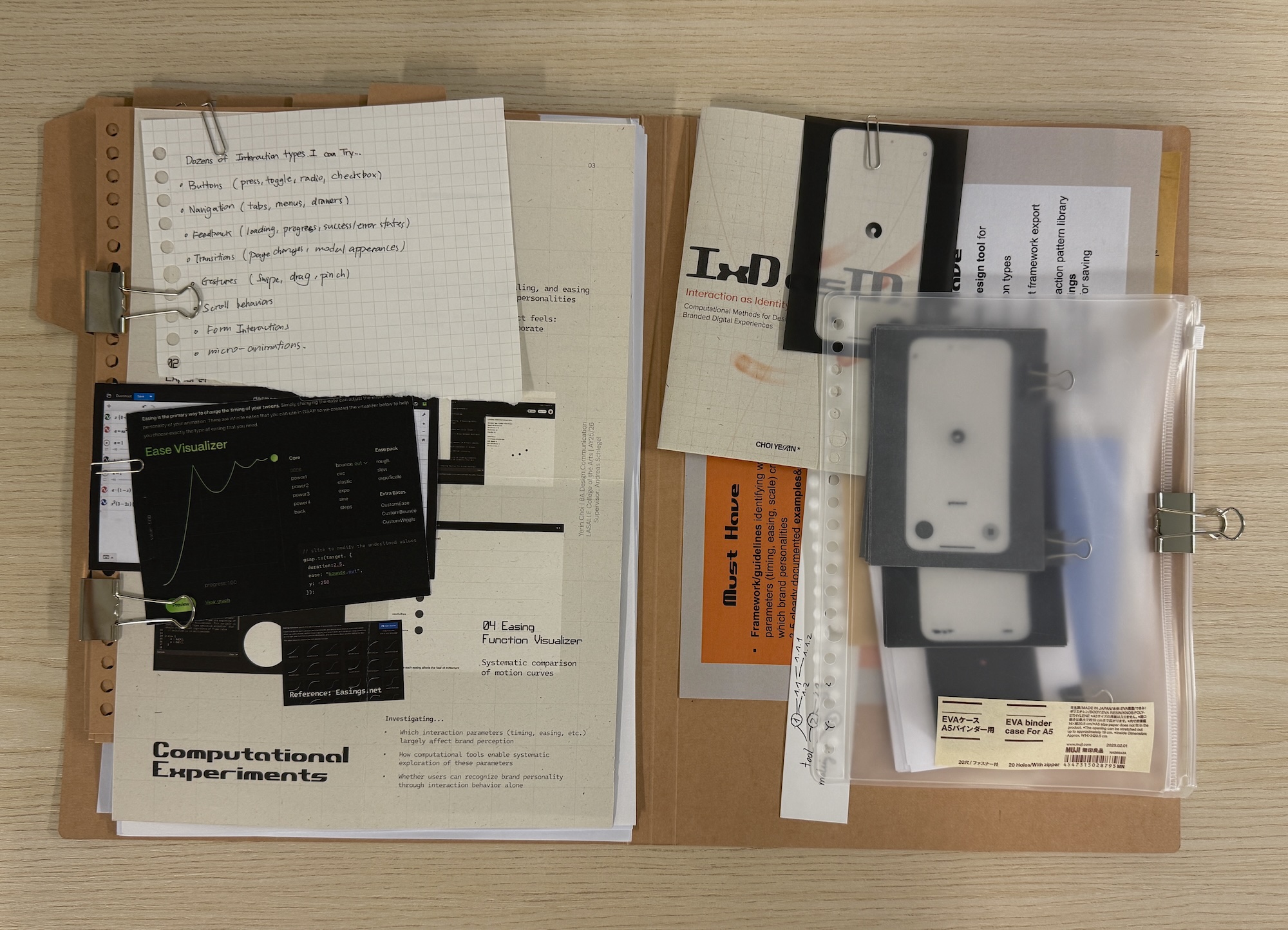
Photo of my file:
Collection of physical materials
MoSCoW prioritization
First, I drew out what I want and have to do using MoSCoW prioritization, and this helped clarify things significantly. MoSCoW (Must Have, Should Have, Could Have, Won’t Have)
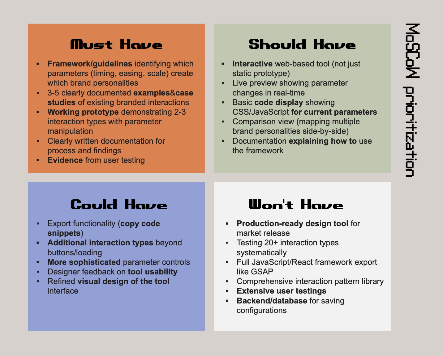
MoSCoW prioritization
Brand Identity Prism
After talking with Vikas on week 5, I realized I haven't been using proper frameworks to distinguish brand identity components. I was confusing personality with identity.
I already knew about Kapferer's Brand Identity Prism from reading his book, but I wasn't applying it critically to my case studies. This was a significant oversight.
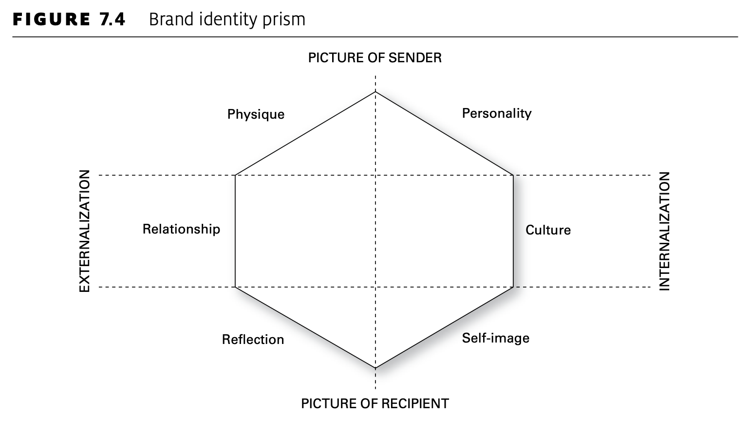
Kapferer's Brand Identity Prism
The Brand Identity Prism breaks identity into six facets:
Physique - Physical qualities and iconography
Personality - Character and attitude
Culture - Value system and principles
Relationship - How brand relates to customers
Reflection - Target user image
Self-image - How users see themselves through the brand
Personality is one factor of the broader term "identity." Using this framework helps me analyze how interactions relate to different dimensions of brand identity, not just vague "brand feeling."
Physical Material Exploration
Rather than making QR codes for each video (tedious for audiences), I started collecting and printing interaction frames.
Process:
Screenshot interactions every 10 frames (at 60fps)
Print on tracing paper to show motion traces
Print on thicker paper to create physical animation flip books
Printing Gemini and ChatGPT interactions frame by frame let me physically understand animation principles and interactions in tangible ways. I could flip through the frames and feel the timing. Also I printed simple nav bars and button actions by states (normal, hover, clicked) to compare them at a glance in printed format.
Frame-by-frame prints
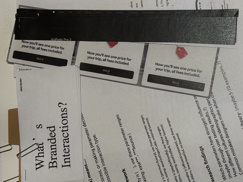
prints of buttons
This process of collecting and printing materials, sitting down and physically dissecting them helped more than just coding, finding functions, and trying them out. I realized that the physical act of organizing makes patterns visible.
Realizations
01 Things I already knew
Looking back at my Week 3 button case study, I already realized buttons weren't just squares but much broader interaction patterns. But I stayed still instead of exploring further. I identified the insight but didn't act on it. This pattern of recognizing things but not pushing deeper needs to stop.
02 Tools Need Good Design Too
To be compelling to designers, even the tools I create need good visual design. I care deeply about design, but I wasn't actually working on designing the appearance of my tools. While focusing on research questions, trying to match methodology, narrowing scope, and keeping neutral colors to exclude visual variables, I forgot something important: making my tools and prototypes visually compelling. Just because I'm testing interaction parameters doesn't mean the interface has to look unfinished.
03 Showing Disconnection
Another realization is that showing opposite examples could be powerful. Demonstrating how disconnected visuals and interactions create weird, disjointed feelings. When they harmonize, they provide the atmospheric experiences I've been talking about. Contrast makes the concept clearer than only showing good examples.
What's Next
Design the tool interface: Make the prototypes I've developed visually compelling, not just functional
Case study mapping: Print and physically map more interactions, dissect them systematically using Brand Identity Prism
User evaluation: Actually start testing. Make simple evaluation sheets.
Read more foundational texts: Strengthen theoretical grounding while doing practical work