03 Entry to Making
Critical journal workshop with Shu Min clarified how to document process. The mind map peer exercise showed me how communication is important. Andreas's "just start making" advice motivated me to to stop thinking and start prototyping.I realized that I'd been hiding in theory, procrastinating the uncertainty of actually building things.
Week-three
01 ~ 07, Sep, 2025Journal-by
Choi YerinKeywords
- Making
- Mindmap
- Atmospheric Aesthetics
- Case-studies
- Makeathon
Getting Unstuck from Theory Mode
Critical journal workshop with Shu Min:
This week began with a valuable workshop on critical journaling methodology. Learning the fundamentals of what to write, how to structure critical reflection, and seeing concrete examples helped refine my approach to this documentation process. Turns out I've been overthinking it.
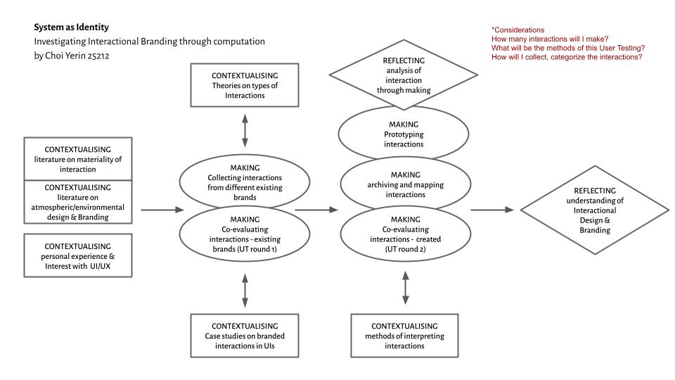
Research Plan - Critical Journal Framework
The most impactful exercise was developing practical research plans. This forced me to translate my theoretical interests into concrete, actionable steps. The mind mapping process (see diagram below) helped visualize my research components.
Atelier Exercise:
Mind Map & Peer Feedback
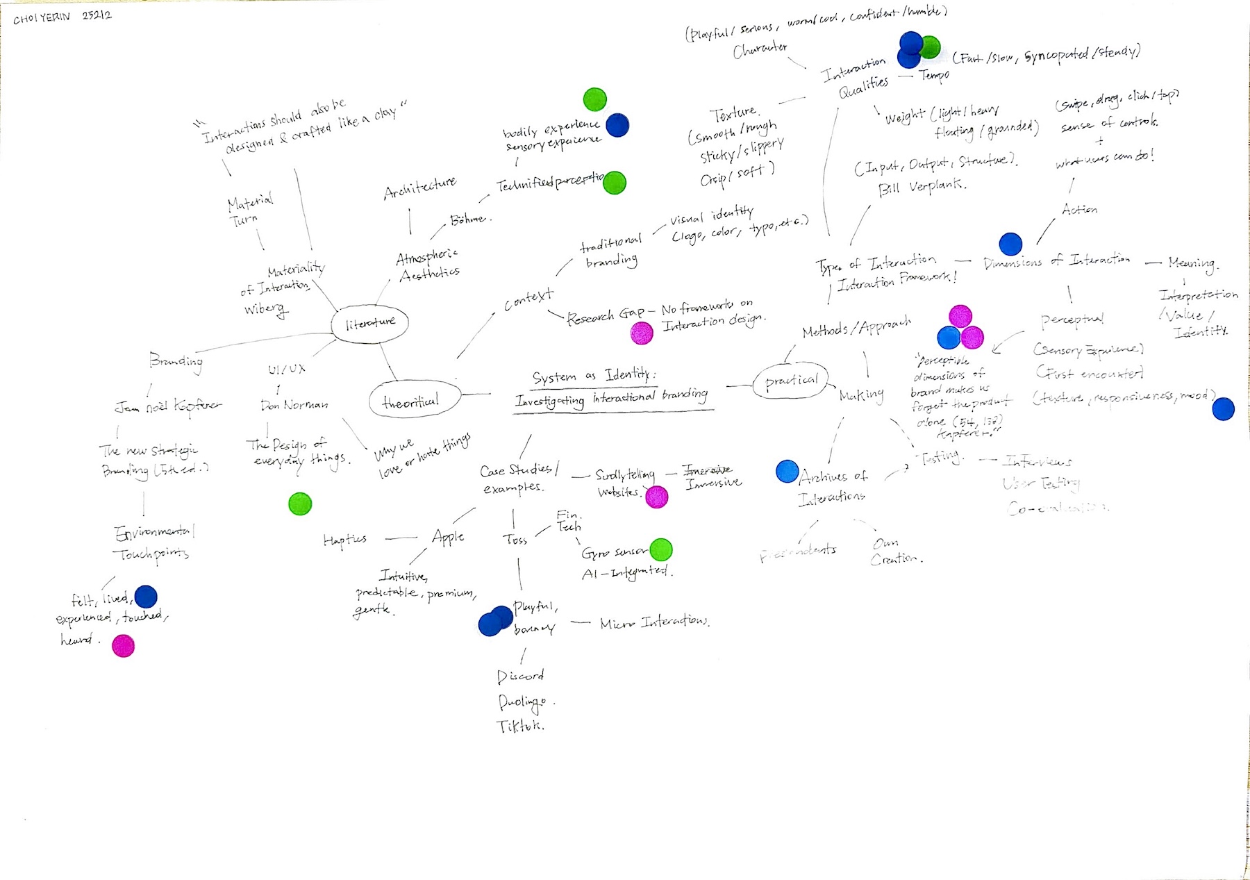
Mindmap exercise and stickers
We put our research mind maps on the table and everyone walked around putting stickers on parts that interested them. I was expecting people to get excited about my core research stuff, but... they didn't (obviously). Most stickers ended up on random words that were respectively interesting but weren't the core of my research.
At first I was kind of bummed but then I realized the problem: I was using all these fancy academic terms that probably sounded like gibberish to people who haven't been reading the same books as me. "Materiality of interaction" and "Atmospheric Aesthetics" - I mean, what does that even mean to a normal person?
It sounds like academic gibberish. Which it kind of is if you can't explain it simply. The stickers that DID get attention: "dimension of interaction," "interaction archive." The tangible stuff. The parts where I talked about actually doing something.
I clearly remember the words Andreas said this week:
Andreas
"Getting started with making might be tough, because you will have to think what you want to make, how, and all these uncertainties. But eventually, it's easy to find yourself just thinking. So if you have difficulty starting, just start, start making, translate your thinking through making. It's fine to stop in the middle, you will get something."
Me
You are right about the "just thinking" trap. I've been hiding in theory because starting to make things feels uncertain. It was easier to just read another paper and feel productive. Time for me to actually make something, even if it turns out bad.
Research Progress
Before diving into experiments, I need to note some reading progress because it's actually clarifying the "through computation, through making" approach.
Böhme's Topos vs Spatium
Reading Atmospheric Aesthetics was more difficult at first because it's about architecture, not interfaces. But his distinction between two types of space is actually perfect for what I'm researching:
Spatium = geometric space (coordinates on a map, measured dimensions)
Topos = lived space (where you actually ARE, what you feel bodily)
Digital interfaces create topos, spaces where users inhabit and feel, not just geometric layouts they look at. Just like physical rooms can feel overwhelming or comforting, interfaces generate atmospheric experiences users feel bodily. and this is exactly what I mean by "atmospheric branding." It's not about how an interface looks geometrically. It's about how it feels to be in it.
Löwgren on Sketching in Code
"For interaction design... when designing innovative interaction techniques, it may be necessary to sketch in software and hardware rather than staying with lo-fi sketching media... the notion of sketching is more about the mindset of the designer than about the medium used." -Jonas Löwgren
This validates my computational approach. So code can be sketching, if I treat it as exploratory and disposable rather than trying to build finished products. This helps me stop overthinking whether my prototypes need to be good enough. "They're sketches."
Making
I: Collection & Analysis
I started by collecting branded interaction examples. Checked out different platforms like UI Movement, Collect UI, Mobbin, Page Flows, 60fps.design, etc. and I found 60fps.design really useful and easy to access, so I decided to invest 82 SGD in the pro version for filters and detailed breakdowns.
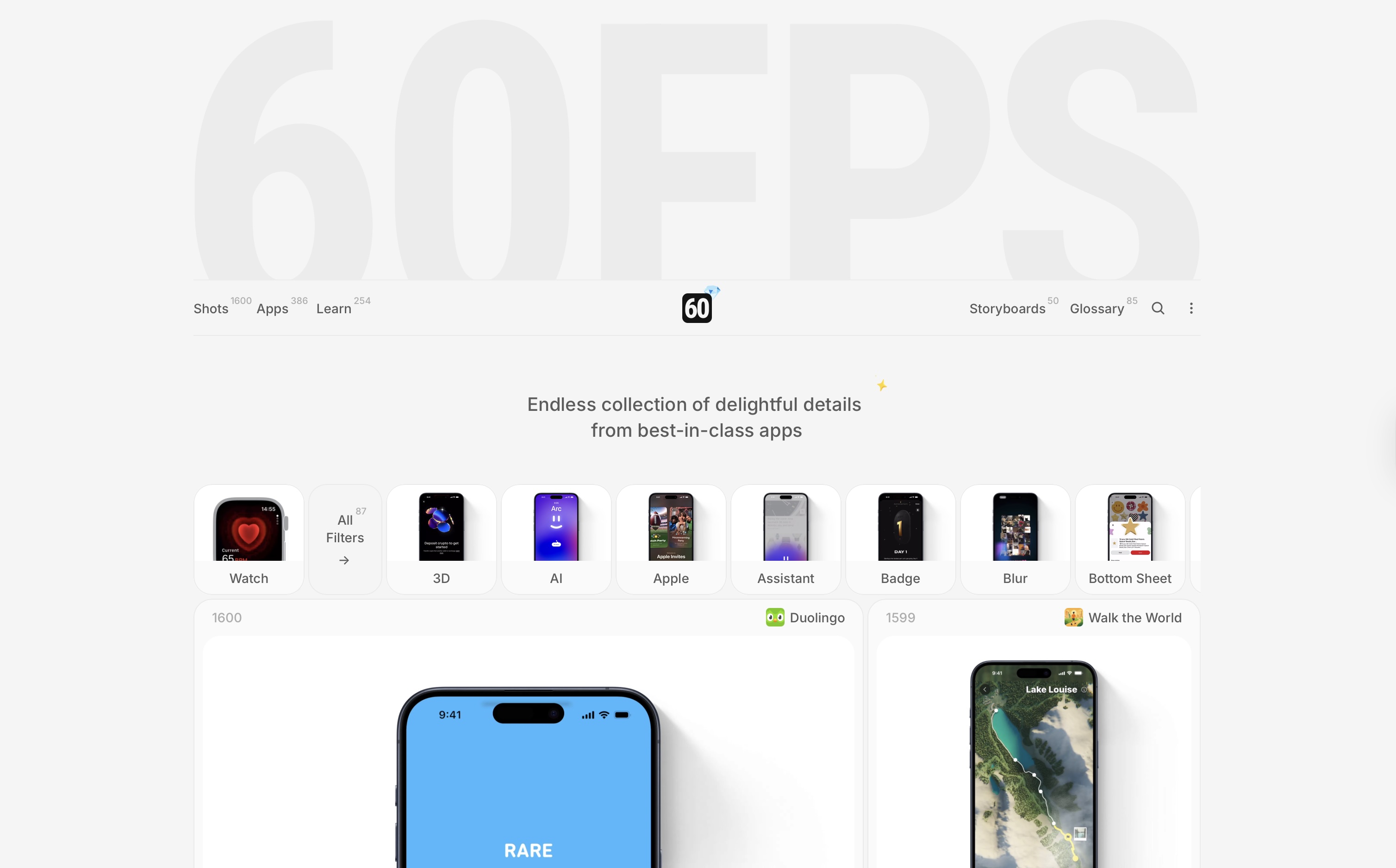
Screenshot of 60.fps. Access from Here
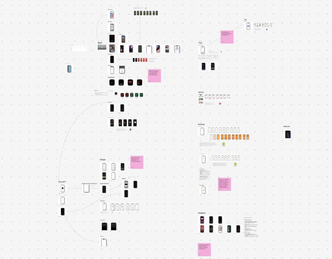
Case Study Progress 01: Screenshot of my Figjam file
Key realization while collecting:
I need to clarify distinctions between motion, animation, and interaction. Otherwise I might accidentally research motion graphics instead of interactions. Motion = visual movement. Animation = timed sequences. Interaction = response to user input. My focus is the last one, interactions, which the other ones can be benifitial for crafting it.
Case Study Findings
01. AI Voice Interfaces:
ChatGPT
Gemini
Google Assistant
Comparing ChatGPT, Gemini, and Google Assistant revealed how identical functions can feel completely different through interaction design. Google Assistant felt static and corporate-friendly, while Gemini seemed more immersive and fantastical. Achieved through different feedback through animations, not only visuals.
02. Apple's Signature Interactions
Wiggling Icons
Slide To Lock
Slide To Unlock
Found distinctively Apple interactions that work without any visual branding:
"Slide to action" patterns
Icon wiggling during editing
Message sending "swoosh"
Dynamic Island behaviors
These feel inherently Apple. There's a systematic interaction language here that reinforces brand values: premium, intuitive, human-centered.
03. Functional Similarity,
Emotional Difference
Toss
Tilt
Comparing Toss's OTP verification (progressive disclosure, gradient effects = unique but also for fast speed and trust) with Tilt's (playful, bold, memorable) showed how identical functions communicate different brand personalities through interaction design choices alone. I'm not talking about how well designed they are visually, but how different interactions can be, for one function.
II: Figma Makeathon Project
To kickstart my making, I wanted to try out some fun project with peers (Carissa and Tanisha) through Figma AI. We created a working website where users plant and water digital wishes.
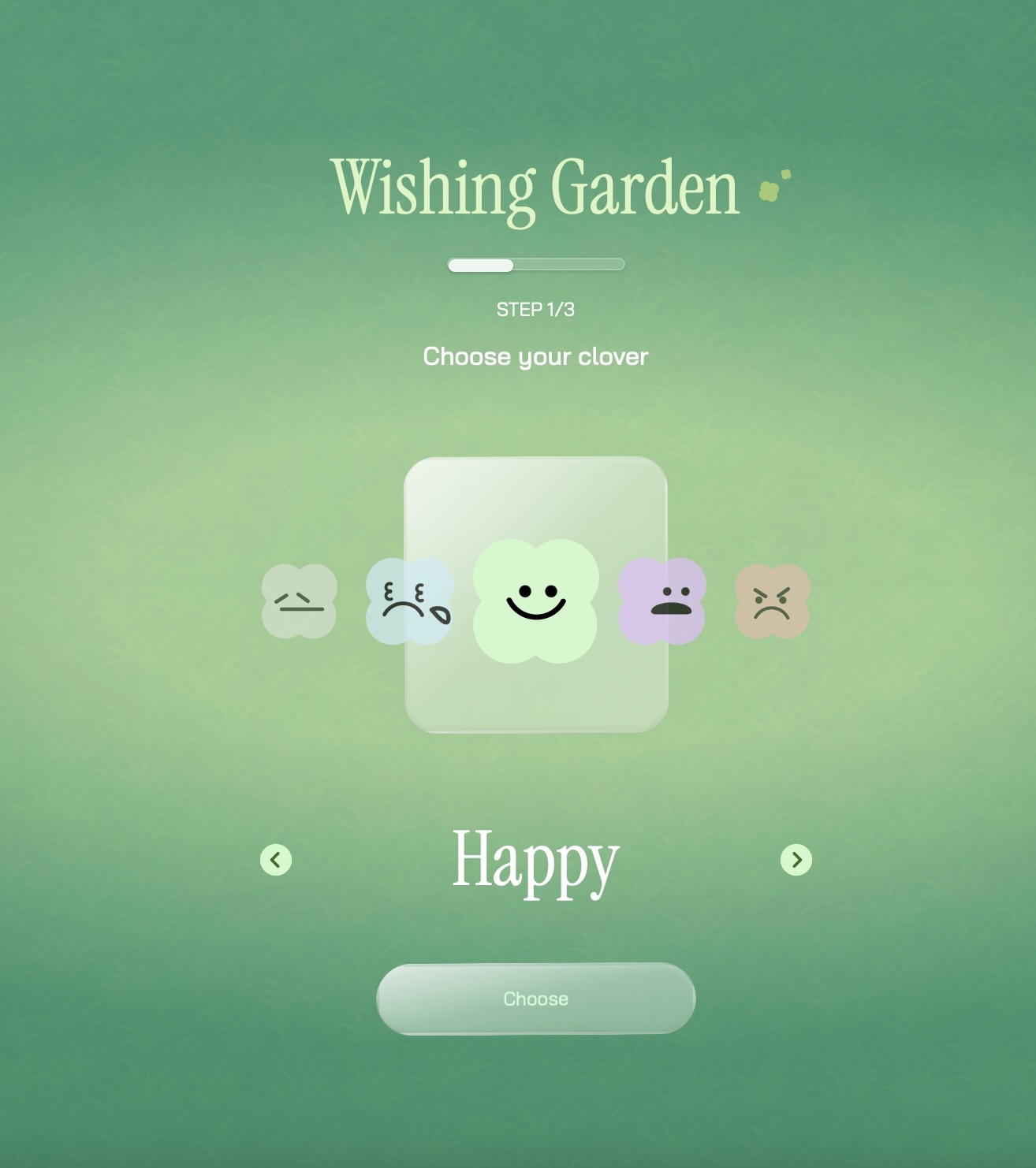
Click Here for interactive file
The concept involves users choosing four-leaf clover types representing emotions, typing wishes, planting them in a collective garden, and watering others' wishes to help them grow.
This project tested collaborative interaction design and provided experience with full-stack implementation using Figma and Supabase integration.
Realizations
""Interaction can affect brands but in turn, brands can affect feeling of interaction.""
Above is an important relization that I want to note this week, from talks with my friend, Ethel. I wasn't really considering this before, but it's actually important. Pre-existing brand perception might influence how users interpret interactions. Maybe those brand halo effects? If I'm testing branded interactions, I need to account for this bidirectional relationship in my research.
What's Next
Stop reading. Start making actual interaction prototypes with variable parameters. Even if they're rough. The uncertainty of making is better than the comfort of endless reading..