06 Finding
Simplicity
This week was a turning point in how I communicate my research. RPO peer review and feedbacks forced me to rethink how I communicate my research through concrete examples and simpler language. Meanwhile, I continued developing loading animation prototypes and discovered the systematic world of easing functions.
Week-six
22~ 28, Sep, 2025Journal-by
Choi YerinKeywords
- Peer-review
- Examples
- Simplicity
- Loading-animationtion
- Easing-function
RPO Peer Review: Reality Check
This week we had RPO peer review sessions and individual consultations. The feedback was valuable and I realized that my writing is too complex and inaccessible.
Key feedback themes:
Make it simple and straightforward.
I'm using too much terminology that readers might not understand. Need to provide examples and simpler terms.
Not about topic, but about research.
I tend to emphasize introducing the topic (IxD, branding) rather than introducing what I'm actually investigating. Readers should understand my research, not just the field.
Finding the middle point.
My writing swings between too general and too specific. Need clearer articulation without narrowing the scope too much.
I also read about seven other students' RPOs and realized mine lacks simplicity and engaging moments. Most peer comments didn't target the core of my research, which means they didn't fully understand my writing. That's my problem, not theirs.
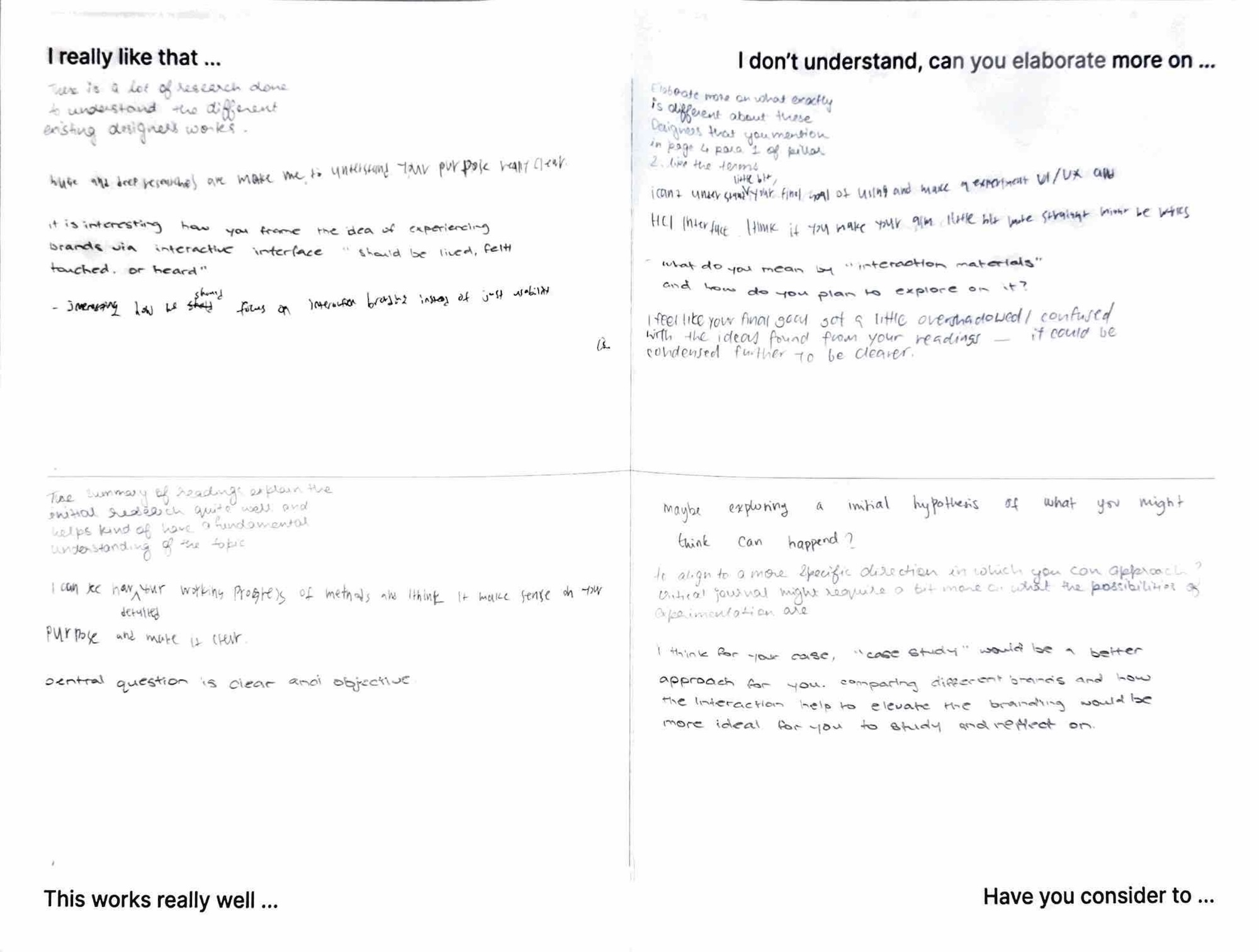
Peer review paper
One comment suggested case studies would be more suitable than computation for my research, which shows they misunderstood my approach. My research objectives and methods sections weren't structured clearly enough to convey that computation IS the one of the core methods, not just a peripheral tool. This feedback stung a bit, but it's exactly what I needed to hear.
Making It Accessible:
Examples and Physical Materials
To make my research more engaging and accessible,
I started developing concrete examples.
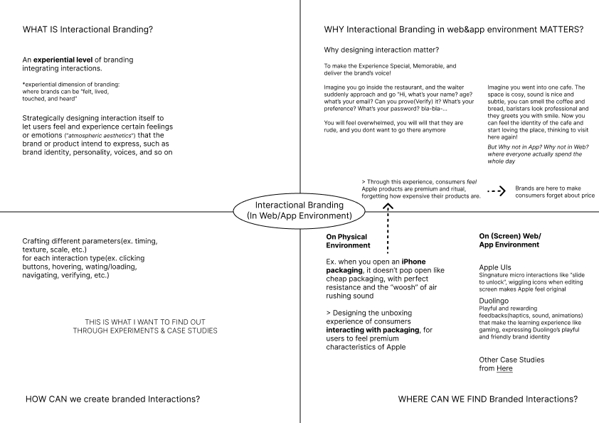
What is branded interaction?
The Apple packaging example I created for my moodboard worked well. People understood it immediately. The precisely calibrated resistance when opening an Apple box, timed to feel luxurious rather than cheap or frustrating. This translates the abstract concept of "interaction carrying brand identity" into something tangible. I'm integrating this into my introduction and creating prints of it for my workspace.
Why does interaction design
matter for brand experience?
Bad interaction design is like a rude waiter:
Imagine entering a restaurant and the waiter immediately bombards you: "Hi, what's your name? Age? Email? Can you prove it? What's your preference? Password?"
You'd feel overwhelmed. You'd think they're rude. You wouldn't want to return.
Good interaction design is like a welcoming cafe:
You enter. The space is cosy. With Jazz music, grinding sound is nice and subtle. You smell coffee and bread. Baristas look professional and greet you with a smile. Now you feel the cafe's identity.
You start loving the place. You want to visit again.
Why not the same attention in apps and websites where people spend their whole day?
This analogy (adapted from Jamal Nichols's "What is Interaction Design") makes the concept immediately understandable without requiring knowledge of HCI theory.
Korean Vocabulary: 감성, 분위기, 느낌
While thinking about "atmospheric branding," I realized Koreans have specific words for this that we use constantly, and even have a trending slang(느좋) for it:
-
감성적인/있는 (gam-seong) - has sensibility/emotion
분위기 좋은/있는 (bun-wi-gi) - has good atmosphere
느낌 좋은 (neu-ggim jo-eun / 느좋) - feels good
We use above words unconsciously to describe nicely designed things. But we don't consciously think "this has emotion" in a literal sense. If you asked me to translate directly to English, I wouldn't say "it has emotion" or "it has feeling" or "it has atmosphere", which just sounds weird.
Maybe closer to English "vibe"? Like "this has good vibes" or "the vibe is right." This is worth exploring more. These Korean concepts might offer a more accessible way to discuss atmospheric branding than heavy theoretical terms like "Böhme's atmospheric aesthetics." People already use these words naturally to describe designed experiences.
Physical Organization:
Prints and Mindmaps
Photo of my desk
To organize my thinking and research materials, I created physical prints and laid them out on my table with important readings and quotes, experiment screenshots, Apple packaging examples showing branded interactions, and heir signature on-screen interactions (slide to action, wiggling icons, etc.)
Mindmap on branded interaction
I also drew a mindmap addressing:
-
WHAT IS branding interactions?
WHY do branding interactions in web/app environments matter?
-
HOW CAN we create branded interactions?
-
WHERE CAN WE FIND branded interactions?
Having these physically visible helps me see connections and keep the big picture accessible while working on specific experiments.
Progress on Loading Experiments
Loading Animation
Experiments
I successfully developed my p5.js sketch for loading animations with real-time parameter manipulation through keyboard controls.
Press Key 1~4 to select animation type
and control by Q/W A/S Z/X
I created four loading patterns to test parameter effects across different visual structures, keeping design neutral (gray colors, simple shapes) to isolate the motion as the variable being tested.
Spinning loader - Rotating elements with motion trail
Bouncing dots - Multiple elements with staggered vertical motion
Breathing circle - Pulsing scale animation
Progress bar - Linear fill with easing
Parameter System
Rather than creating fixed animations, I built a system where I can adjust parameters live and observe how they affect brand personality perception.
I could achieve such parameters using functions like frameCount, sin(), cos(), lerp(), rotate(), etc.
The key parameters(custom variables) I'm manipulating:
01 Timing
animationSpeed : How many frames per cycle (lower = faster)
delayBetweenElements : Stagger timing between multiple elements (creates rhythm)
02 Motion
smoothness : Easing amount controlling how gradually motion happens (lower = smooth), (higher = snappy)
bounciness : Overshoot effect when reaching target (1.0 = none, 2.0+ = bounce)
intensity : Overall motion magnitude
03 Visual
elementSize : Base size of loading elements
elementCount : Number of elements (for dot-based animations)
Implementation Approach
The keyboard controls let me adjust parameters while the animation runs:
1-4 keys switch animation types
Q/W adjust speed
A/S adjust smoothness
Z/X adjust bounciness
Spacebar logs current configuration to console
This real-time manipulation was crucial to can immediately see how changing one parameter transforms the same animation to feel completely different.
Key Learnings:
Parameters Can Override Visuals
What struck me was changing one parameter completely transforms the brand impression even with identical visual design.
Same spinning circle, different parameters:
(speed) + (smoothness) + (bounciness)
(20 frames) + (0.05) + (1.0) = feels mechanical, corporate, efficient
(80 frames) + (0.8) + (1.3) = feels considered, premium, deliberate
(60 frames) + (0.4) + (2.0) = feels playful, friendly, game-like
Above is what I could observe by manipulating parameters with the same visual (spinning circle). Although I still have to conduct a more focused user evaluations, I could clearly observe how personality can come entirely from the motion parameters, rather than the visuals.
This validates Vallgårda and Redström's concept that I explored earlier, "controlled transitions between states" are what create the experiential quality. The parameters controlling those transitions ARE the brand expression.
Consultations
Discovery:
Penner Easing Functions
During consultation while showing my loading animations, Andreas introduced me to Penner easing functions. I already knew general easing concepts (ease-in, ease-out, ease-in-out) from my UI/UX background and previous button experiments. But I hadn't looked into the actual mathematics and systematic methods behind these functions.
Turns out there are extensive variations of easing functions, each with specific mathematical formulas. This is something concrete I can experiment with systematically.
Practice sketch integrating easing functions on p5.js (followed tutorial)
To interact with, Click anywhere in the sketch
While exploring how to sketch these easing functions in p5.js, I discovered some websites:
easings.net - Shows the easing functions visually with their curves and comprehensive codes.
cubic-bezier.com - Lets you directly edit and create custom easing functions
These tools are incredibly useful. I can see exactly how different easing curves affect motion, then implement them in my prototypes.
Recap: Things I'm Learning
Simplicity matters more than sophistication: Complex terminology doesn't make research stronger, it makes it inaccessible. Examples, analogies, and clear language communicate better than theoretical jargon.
Parameters: Through loading animation experiments, I'm seeing how specific computational parameters (rotation speed, easing curves, bounce amplitude) directly translate to brand personality impressions.
RPO refinement: Revise the research proposal with clearer language, less ambitious claims, and more precise terminology.
Existing tools are resources: Rather than discouraging me, they became valuable resources for understanding the parameter space I'm exploring.
Physical organization helps thinking: Having prints and mindmaps visible on my table makes connections more apparent than keeping everything digital.