13 Get Back
to Building
This week, I finally got back to VS code environment, architecturing the tool's internal logic and implementating them. The goal was to translate subjective motion into a manageable system by defining a Hybrid State Structure. Critically, during the iterative building process, I made a major technical decision from Vanilla Javascript to React to ensure that tool has the robust state mangaement required for its complex architecture.
Week-thirteen
10 ~ 16. Nov, 2025Journal-by
Choi YerinKeywords
- Tool-Architecture
- React
- State-Management
- Per-Property-Control
- Iterative-Build
The Implementation Reality:
Translation to React
The technical ambition of the comprehensive tool quickly exposed the limitations of my earlier approach, forcing a fundamental mid-project pivot.
I initially started implementing the new architecture with Vanilla JavaScript (similar to what was used in the simpler prototyp), but the process was too slow and led to significant stability issues. It was taking much longer to write than the earlier Button Parameter Lab and the code was becoming buggy.
So, I made the necessary decision to pivot to React. Although this imposed a steeper learning curve, it was a better way to achieve the robust state management and component architecture required for a professional tool. I relied on my ongoing self-learning (Sololearn app, YouTube tutorials) to execute this transition.
Code Translation: From Script to Component
The shift to React was essential because the Vanilla JS model relies on manual DOM manipulation and global variables to track state, which quickly becomes messy. React’s component-based model fundamentally solved this, as evidenced in SketchElementPage.jsx
Code Translation: JS vs. React Architecture
| Concept | Vanilla JS |
React |
Architectural Justification |
|---|---|---|---|
| Data/
Element List |
Global array elementsData | Managed by useState hook: const [elementsData, setElementsData] = useState([]) |
Reactivity: Changes to the data automatically update the UI (JSX) without manual DOM rendering, drastically reducing bugs. |
| Selection State | Global selectedItems = new Set() with manual checks | Managed by const [selectedItems, setSelectedItems] = useState(new Set()) |
Stability: Selection logic is tied cleanly to the component lifecycle. |
| UI Updates | Manual renderElements() and innerHTML updates |
Automatic via JSX rendering triggered by setElementsData |
Efficiency: Enables a clean, declarative model, moving focus from how to draw the DOM to what the state should be. |
Information Architecture:
Approaches to State Model
The true challenge of the prototyping was securing the State Machine Architecture within the new React framework. My extensive planning for button types (Action, Selection, Toggle) quickly revealed that I needed to handle complex, conditional states.
The Struggle with Compound States
I initially planned to hardcode all compound states (e.g., Selected / On + Hover, Off → On). This level of granularity, while accurate to real-world interaction, was visually overwhelming for the designer and extremely difficult to manage in code, confirming the gap identified in the Figma/HANA analysis.
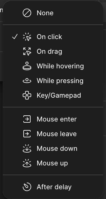
Trigger options (Figma)
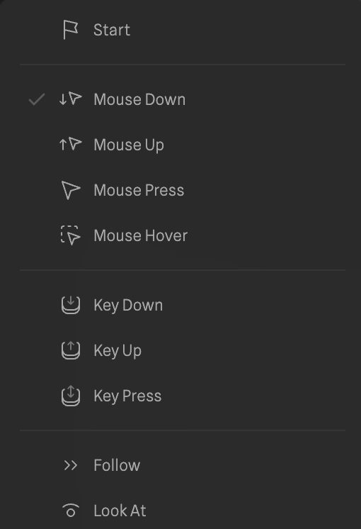
Event options (HANA/Spline)
The Hybrid Solution
I finalized with the Hybrid State Model by moving complexity away
from the state name and into the component's conditional logic:
Prototype Process Demo for the dynamic state & Button Types names
Conditional Parameters:
I added helper functions and state properties that govern behavior, such as stayInReleasedState (for toggle/selection buttons) and logic to override Hover during Pressed or Released states. This simplifies the visible state list while preserving the necessary parametric depth.
Taxonomy Logic:
The function handleElementTypeChange ensures that when the user switches a button type, the tool automatically toggles state visibility based on support (e.g., hiding Loading states for a Select button), ensuring embedded knowledge is baked into the tool's core.
Semantic Mapping:
Functions like getStatePseudoClass map user-friendly names such as Selected / On to the necessary CSS data attributes like data-selected="true" needed for styling the final output.
Tool Logic & State Management
Moving beyond basic architecture, I defined the tool's core operational logic (how it handles elements, effects, and feedback) to fully realize the Hybrid State Model. This required architecting specific data structures to handle the complexity of branded interaction.
1. Element Logic & Taxonomy
The core of the tool relies on a smart taxonomy system. Instead of treating all buttons the same, the code distinguishes behaviors via elementType.
-
Logic:
The function handleElementTypeChange actively manages state availability. -
Embedded Knowledge:
For example, if a user switches a button from "Action" to "Select," the system automatically hides irrelevant states (likeLoading) and enables specific ones (likeSelected). This ensures the tool's interface adapts to the user's intent, embedding design knowledge directly into the logic.
2. Feedback as Modular Properties
To achieve high-fidelity "branded" feel, visual changes couldn't be simple CSS class toggles. I architected stateFeedback as a modular array system:
Each state (e.g., Hover) contains an array of independent feedback objects (Shape, Fill, Stroke, Effects).
Effect Management
Complex properties like Neumorphic shadows or Glows are managed as specific objects within the feedback array (addEffect, updateStateFeedback). This allows users to stack multiple shadows or blend modes, which is essential for creating the "tactile" depth observed in my case studies.
3. The Hybrid State Machine
The most significant logical hurdle was handling compound states without overwhelming the user. I implemented a Hybrid State Model:
-
Explicit States: Visual states like
Rest,Hover, andPressedare explicitly defined. -
Implicit Logic: Conditional behaviors—such as whether a button stays pressed after release—are handled by boolean flags in the component logic (stayInReleasedState) rather than creating new, confusing state names. This keeps the UI clean while allowing the code to handle the complex state permutations required for Toggle and Selection buttons.
Next Steps
The next phase is stabilizing the new React implementation and adding functionality for Transitions, Action, Code Preview & Export, and Presetsbased on my previous research findings
Debugging: Debug the UI integration for the React in certain functions like cut off effects.
More functions: As now I built the basic tool's architecture and layout, I'll revisit my prototype from Figma to add more functionality to the tool such as code export and preview functions for implementation of the tool.