12 Learning
from Industry
This week was a deep methodological investigation into the existing ecosystem of design tools, serving as the foundation for the next tool's architecture. The goal was to identify the critical gaps left by platforms like Figma and HANA, but rather, I got to learn a lot of lessons from the embedded knowledge in the tools.
Week-twelve
03 ~ 09. Nov, 2025Journal-by
Choi YerinKeywords
- Tool-Case-Study
- Ecosystem-Analysis
- Gap
- Prototyping
- Emotional-Design
Atlier
& Reading Progress
During this week's Atlier, we were informed to make Catalogue of Making (publication or website) to visually communicate the research outcomes from experiments. Andreas provided some good references for this from previous students with us. From physical publication by Aditi to Websites by Rachel, Soda, and so on, their Catalogue of Making were inspiring and well documented the outcomes and process, in a visually appealing way. I was motivated and excited to create my own, but at the same time, worried about the timeline I got for submission, as I was still working on my experiments, case studies, and dissertation draft.
Catalogue by Rachel
Catalogue by Soda
Prototypes by Soda
Norman on Emotional Design
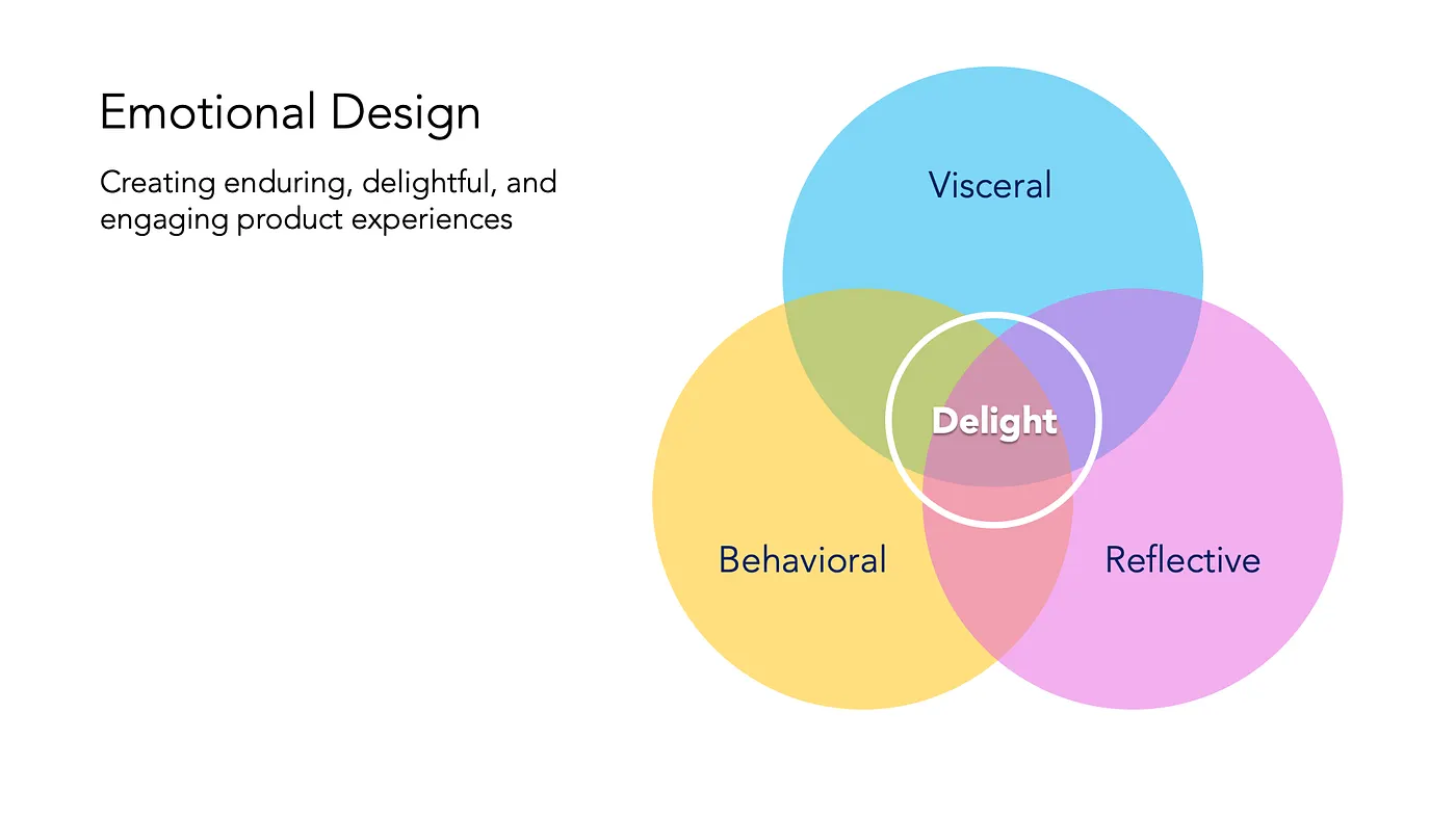
> 3 Levels of Emotional Design | Source: Justin Baker, Medium
This week, I dedicated some reading time to Don Norman's Emotional Design. This reading was critical for positioning the strategic value of branded interaction. While usability operates at the Behavioral level, branded interaction aims for the Reflective Level, where memory, meaning, and loyalty are built through cohesive, felt experiences. The final tool must generate experiences memorable enough to reach this level of emotional connection.
Tools Analysis
Industry Flow
My primary focus was a systematic case study of current prototyping or interaction design (IxD) tools to define the architecture of my next prototype and perform a critical gap analysis that justifies my project's existence. Below is some compliance of my analysis that I mapped out on table
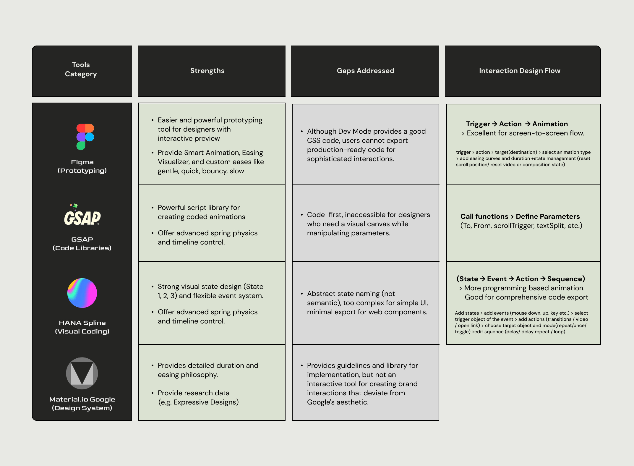
My table of Tools Case Study - Figma, GSAP, HANA (Spline), Material Design (Google)
I tried using these tools quite some times, especially Figma, but, there were a lot of things to learn from these tools after I started to analyze them. This was a similar realization after recreations as well, just like how Norman describes that behavioral level happens in subconscious level, as we are not conscious about what we are doing, or why we like things, but being noticed by professionals who analyze them. One of the interesting findings was how different tools take different appraoches in designing interaction to make the process more intuitive and user-friendly.
Figma: The Screen-to-Screen Flow
Flow: Trigger > Action > Target (Destination) > Select Animation Type > Add Easing Curves and Duration > rightarrow > State Management.
-
Gap: Figma’s predefined animation types and lack of custom events or actions restrict the designer's ability to create the nuanced, bespoke motion necessary for dynamic branded interactions. There are limitations in code export features in Figma, especially not being able to export interactions and animations to code.
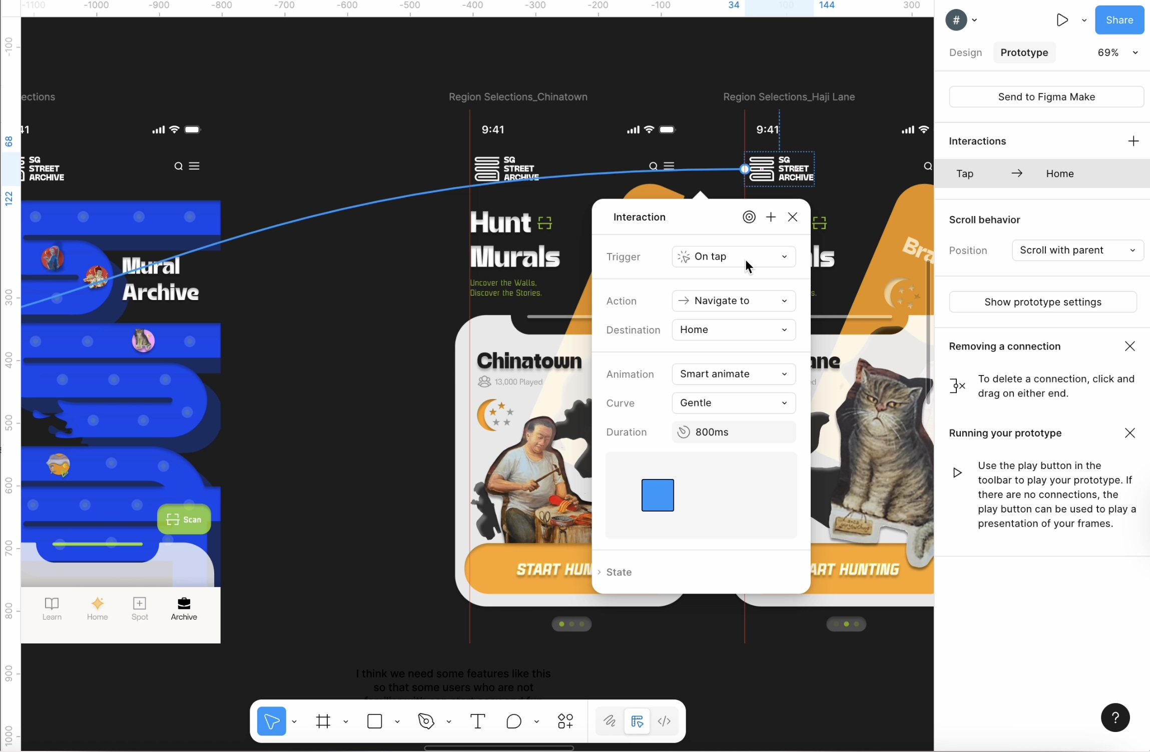
Screenshot of Figma Interface in prototype more
HANA (Spline): The State-Driven Flow
HANA/Spline uses a more programming-based, event-driven approach:
Flow: State > Event > Action > Sequence.
-
Process: Add states > Add events > Select trigger object > Add actions (transitions / video / open link) > Choose target object and mode > Edit sequence (delay/ loop).
While good for complex state management, this flow is often overly complex and uses abstract naming, lacking the accessibility needed for visual designers, especially in rapid UI micro-interaction design.
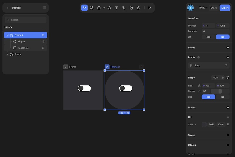
Screenshot of Hana Interface in prototype more
New Prototype:
Sketch Interaction
Design Evolution
This week, while conducting the tool case study, I have also been working on designing the tool's user flow and basic interfaces for the new prototype. This time, I wanted to build a more comprehensive tool, better then staying with exploratory levels like parameter labs.
I actually haven't decided what to call this tool yet but I'm just calling it Sketch Interaction or Sketch Button based on my readings for treating computation as a sketchbook for interaction design.
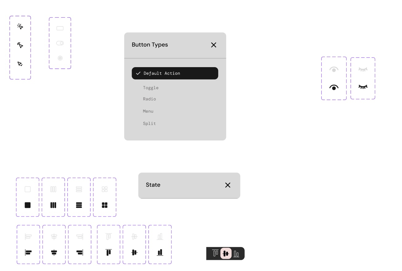
Also, I decided to focus more on buttons first, as I have been establishing better foundations for buttons and feedback during this semester. So, I decided to rather stay in button and develop a better tool, while deeping knowledges and skills in other animations or bigger behavioral patterns.
First draft design prototype from Figma
I maintained the tactile Neumorphism base established in Week 08, but I decided to add more color and visual icons this time. This shifts the design from a neutral research instrument to a visually compelling product that invites interaction, while still prioritizing functionality. The final look and layout followed the tested framework of Button Parameter Lab (Prototype 2), ensuring cohesive design within the tool's ecosystem and usability.
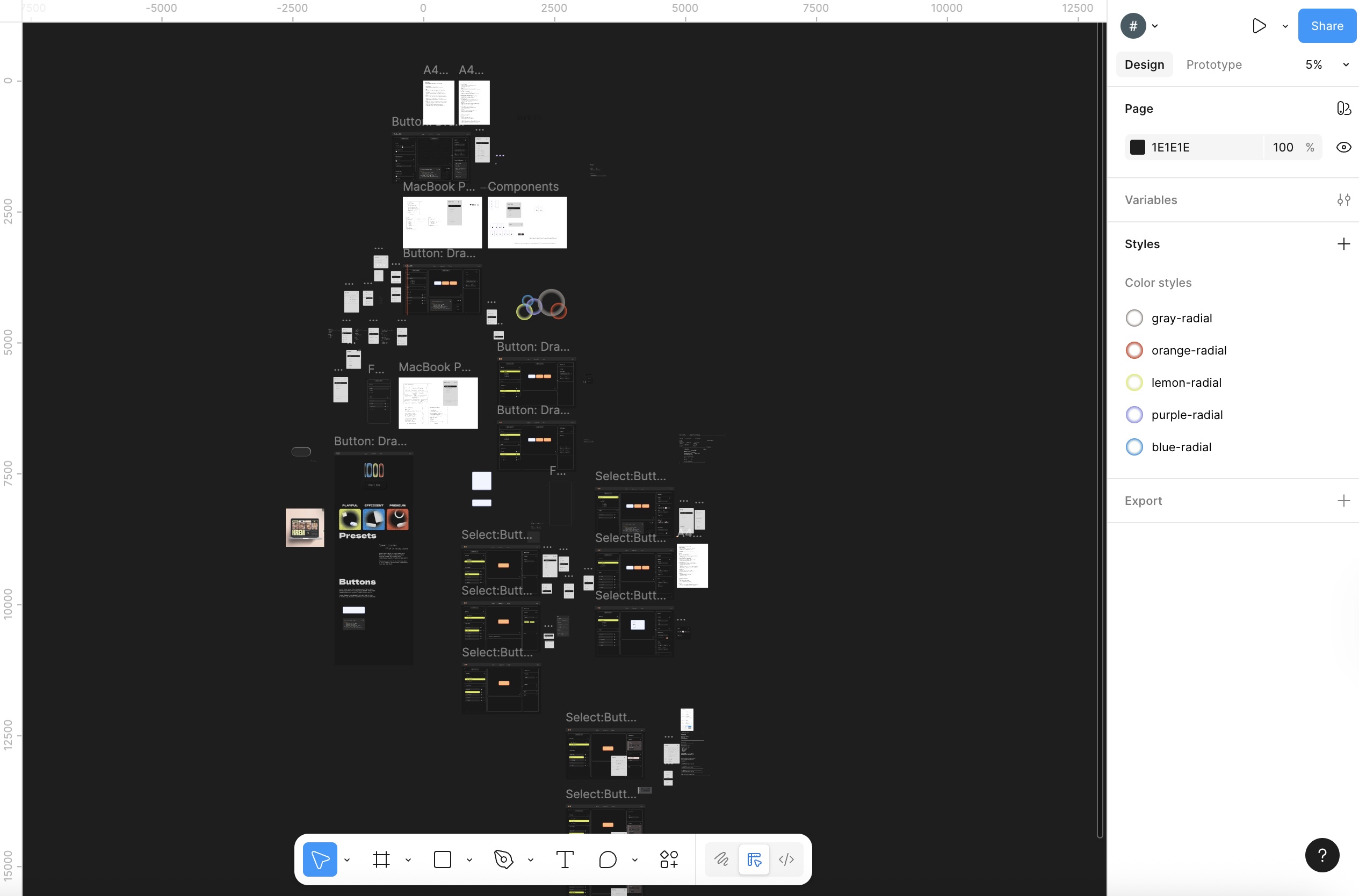
Figma File for initial design
Components for initial design
(I designed the icons myself as well for better consistency within the tool)
Before starting to develop the tool I created some prototypes to see a better userflow using Figma, and some of the basic initial design systems and components that I will address more after I build the functionality of the tool.
Next Steps
The tool analysis and figma prototyping provided the final requirements for the Phase 2 build. The immediate focus is to actually develop the tool first, while fixing some construction of the comprehensive tool logic and state management for the final prototype, ensuring it can generate the systematically verified parameters identified in Week 11.